

What:
Project Overview
RezX is a unique business automation software for restaurants, cafes and other service sector representatives.
My role:
Sr. UX/UI Designer
Responsibilities:
Defining the UX strategy for reservation and table management
Translating complex operational workflows into fast, low-cognitive-load interfaces
Leading UX decisions across reservation creation, live table status, and waitlist management, etc.
Collaborating closely with:
Product Manager (prioritization & scope)
Engineering team (feasibility & system states)
Business stakeholders (restaurant operations)
Problem:
Restaurants struggle with managing reservations during peak hours due to fragmented tools, manual processes, and lack of real-time visibility into table availability and guest status.
Goal:
Help restaurant managers and hosts manage reservations, tables, and guests in real time, reduce no-shows, and keep service running smoothly during busy hours.
Who :
User Research
Core UX Strategy & Principles:
Speed over perfection – actions must be completed in seconds
Visual status first – color and icons instead of text
Single-screen decision making – avoid navigation during service
Progressive disclosure – advanced data only when needed
Pain Points
User problems:
Hosts need to make decisions within seconds during peak service
Existing tools are too slow, text-heavy, or require multiple screens
Hard to track: Table status, Guest preferences and allergies
Business problems:
Lost revenue due to no-shows and poor table utilization
Inefficient seating leads to longer wait times
High staff stress during service hours
User Journey Map
Developed a user journey map of a restaurant manager's experience with the site to pinpoint potential pain points and identify areas for improvement.
Goal
Reduce manager stress during peak service and improve table utilization.


Why:
Usability Studies
Conducted unmoderated usability studies with several participants, who answered various questions about the site and shared their observations while interacting with the low-fidelity prototype. Ultimately, I identified key themes and generated several insights.
Creating a Reservation
Side modal instead of full page
Keeps the table layout visible in the background
Date&time picker for speed
Hour-first selection
Disabled unavailable slots
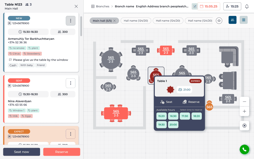
Hall & Table Overview
Card-based table layout
Easy scanning from distance
Time badges (e.g. 21:00)
Immediate understanding of occupancy
Live Reservation & Waiting List
Status-based tabs instead of time-based lists
Matches real host mental model
During service, hosts don’t “read” — they recognize patterns.
How:
Refining Design
On this step I designed high fidelity mockups based on research and studies explorations. Also built Design System and made it scalable, clear and consistent. I tested mockups for WCAG standards, also followed UX writing principals.



Results and my Reflection:
Outcome
Impact:
Reduced error rates
Higher task completion confidence
Faster seating decisions during peak hours
Better handling of no-shows and late arrivals
Improved guest experience
What I learned:
The main thing I learned that even a small change can have a huge impact on the user experience. The most important takeaway is to always focus on the real needs of the user.
Next Steps
Conduct follow-up usability testing on the new iteration.
Identify any additional areas of need and ideate on new features.