
What :
Project Overview
Designing the first digital control system for an AgriTech company automating mushroom cultivation, monitoring, and harvesting with robotic manipulators.
My role:
Product, UX/UI Designer
Responsibilities:
User Research, Experience mapping, User flows, Defining MVP
Information Architecture and Flow
Visual Prototyping and Wireframing
Heuristic Metrics
Users testing
Industrial UX
Problem:
No tools. No visibility. No control.
Before this app existed, the entire operation was managed manually. Workers physically walked the shelves, made decisions based on direct observation, and had no systematic way to track environmental data, robot status, or harvest progress over time.
Goal:
The AgriDrone project addresses the challenges of efficient crop monitoring, offering solutions for early disease detection and optimized resource allocation through autonomous drone technology.
Challenge:
The core challenge was not just digitizing a workflow — it was designing the very first interface between humans and an autonomous robotic system, for users who had never worked with digital tools before.
Who :
User Research
I conducted interviews and observations with both farm operators and managers.
Operators are physically active, working in a humid, low-light environment — they need glanceable information and large tap targets. Managers are more data-driven, reviewing performance trends and making strategic decisions.
Understanding the users and the environment
users trusted their own eyes over any system, so the app had to build trust by being consistently accurate.
Alert fatigue was a real risk – too many warnings would be ignored.
And any testing or maintenance flow had to feel guided, not open-ended.
Pain Points
Zero baseline
Users had no prior experience with control software. Every interaction pattern had to be learnable from scratch.
Safety-critical context:
Mistakes in robot control or missed alerts could damage crops or equipment. Error tolerance had to be near zero.
Two user types
Operators on the floor need quick action; managers need overview and data. One app, very different needs.
Complex system, simple interface
Mistakes in robot control or missed alerts could damage crops or equipment. Error tolerance had to be near zero.
Why :
Key decisions
Working solo meant owning every phase — from early field visits and user interviews to building the visual design system, writing interaction specs, and staying closely involved during development. I iterated based on feedback from operators, which surfaced practical issues like tap target size, screen glare, and the need for larger typography in certain states.
The visual language was designed to feel clean and trustworthy, not clinical. An olive-green and off-white palette, rounded components, and clear iconography were chosen to feel approachable to non-technical users while still conveying precision.
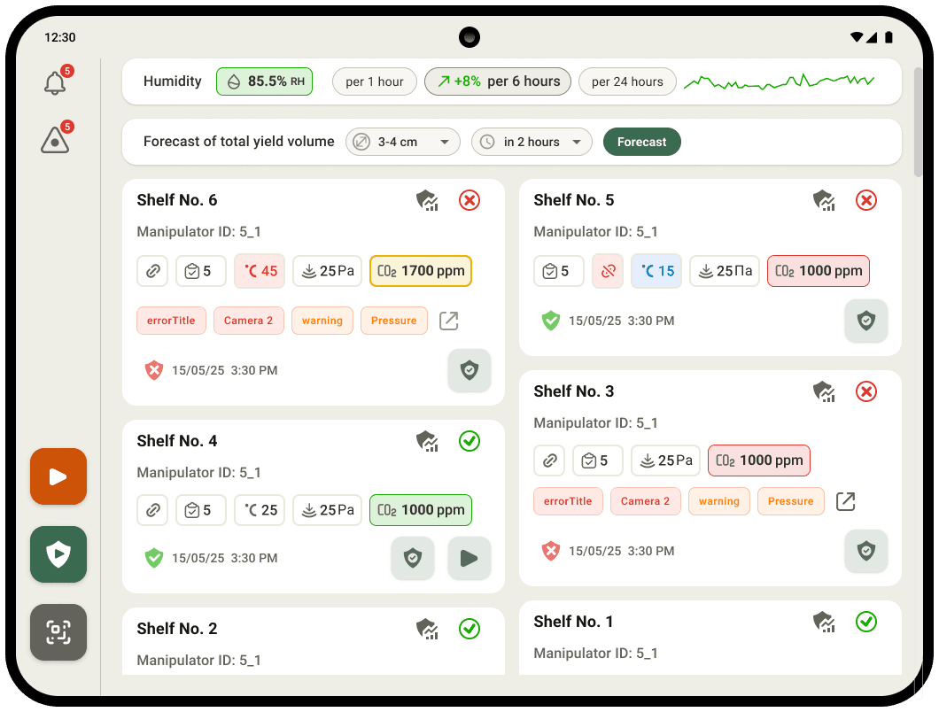
Dashboard with at-a-glance shelf status
scan the entire farm in seconds without reading individual values
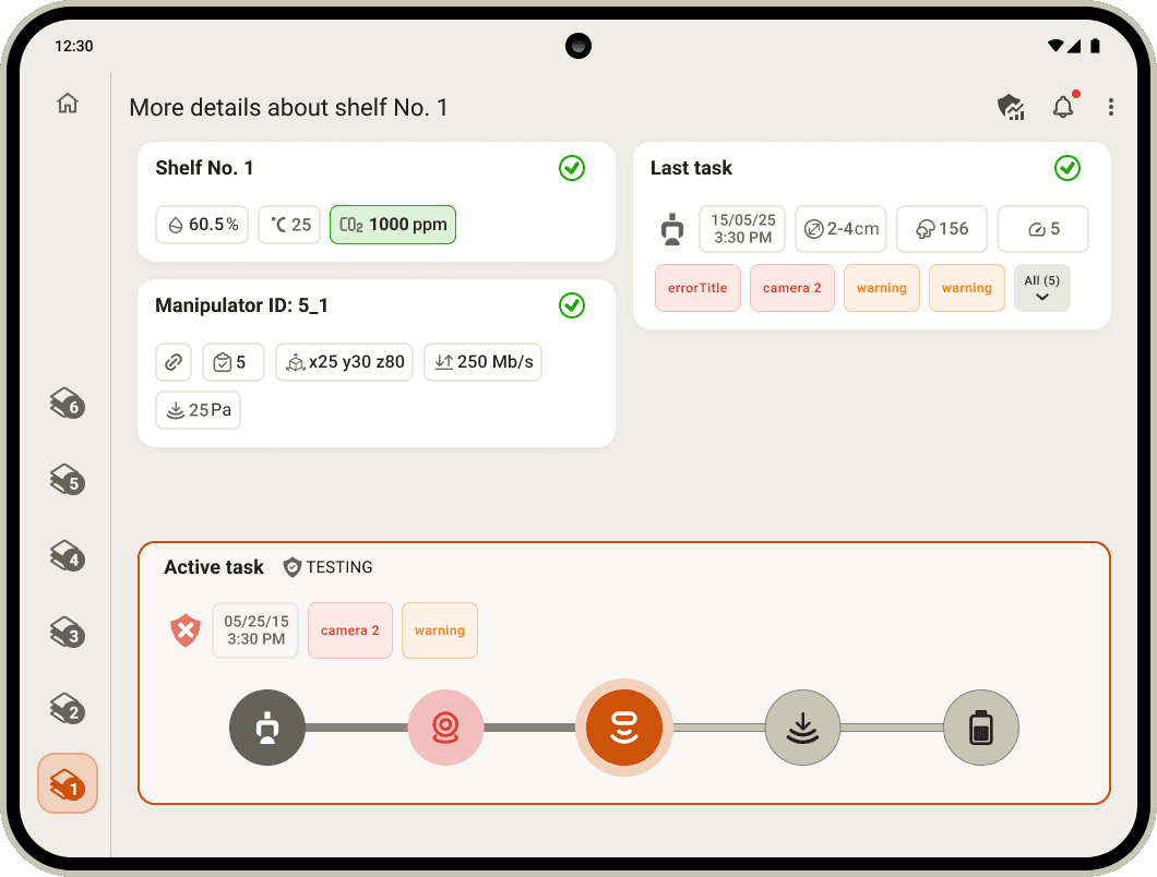
Step-by-step automated testing wizard
Users see exactly where they are, what passed, and what failed.
Shelf detail view with live monitoring
This gives the depth without cluttering the main dashboard.
Harvest yield prediction
A forecast bar at the top of the dashboard lets users set parameters (mushroom size range, time horizon) and trigger a harvest volume prediction.
Contextual alerts with error tags
Errors surface as specific tags tells operators immediately what failed and where.
Humidity strip and trend indicators
A persistent humidity bar at the top - This is a critical environmental factor in mushroom farming that needed to be always visible — not buried in a submenu.


Outcomes :
Impact
The app replaced a fully manual process with a real-time, data-driven control system. Both operators and managers adopted it as their primary tool. The testing wizard in particular reduced the time and expertise required to diagnose robot issues — a task previously handled only by engineers.
Reflection :
What I learned
Designing for first-time digital users requires radical simplicity.
Every pattern I took for granted had to be validated — icons, step indicators, color meanings. Nothing could be assumed.
The physical environment shapes the design.
The farm floor is humid, noisy, and fast-paced. This drove decisions around contrast, touch target size, and information hierarchy more than any design trend.
Two user types need one coherent interface.
Giving managers depth while keeping operators efficient required careful layer thinking — global overview first, drill-down second.
Trust is the core design goal in industrial UX.
Users will only rely on a system they believe is accurate. Consistency, clear feedback, and honest error states were more important than aesthetic polish.